
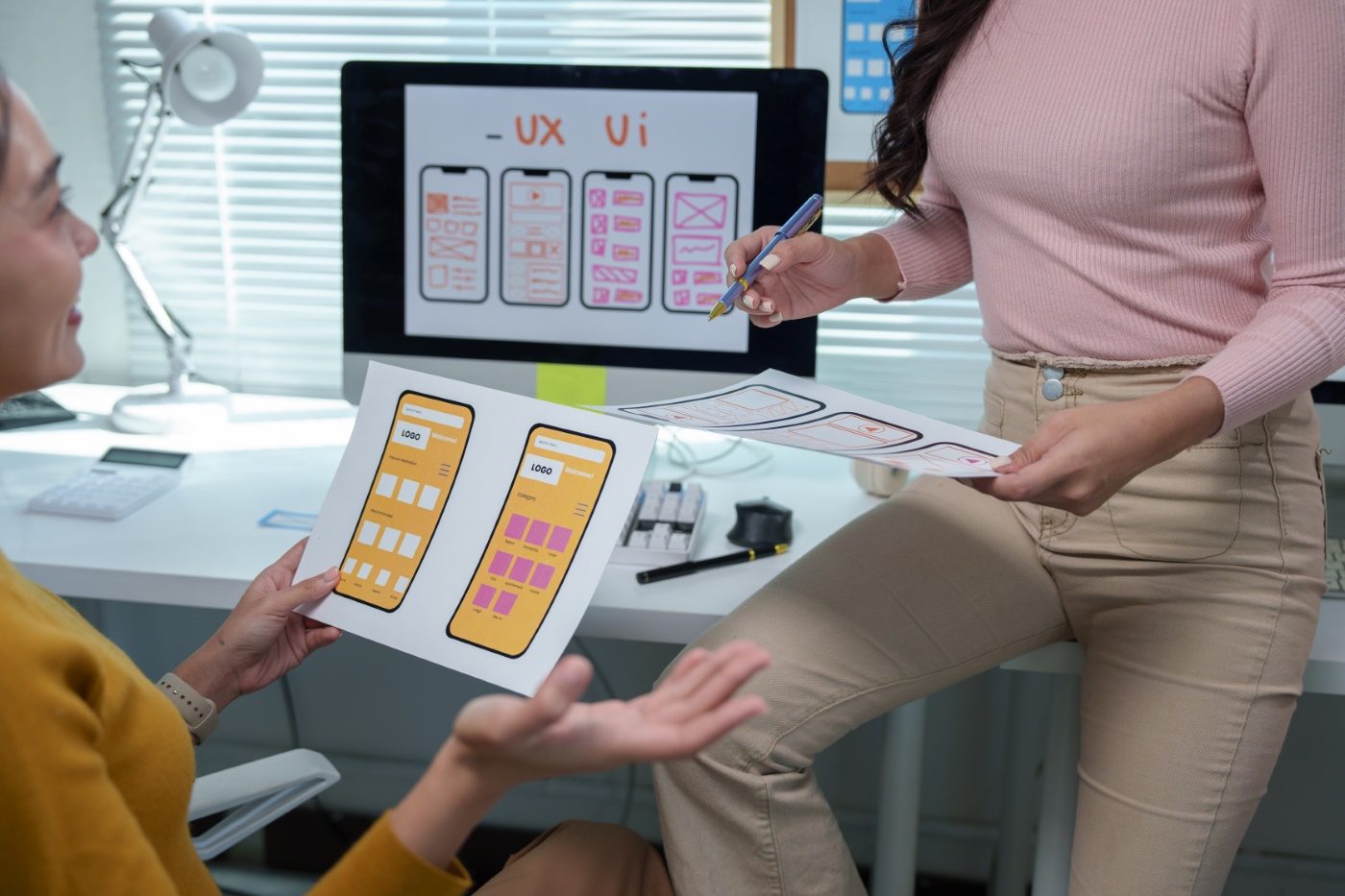
Crooked Layouts Break Trust Before You Say a Word
Your content can be excellent. If the layout is visibly out of true, the first impression is spent before anyone reads a line. Most visitors do not give a page a second look.
Cards that do not share an edge. Text starting at a different left margin in every section. A button parked slightly off center. People register all of it without naming any of it, and what lands is a page assembled rather than designed, which reads as untrustworthy.
The cost is not only cosmetic. Misalignment breaks the path the eye follows down the page, so visitors work harder and quit sooner. We grid every build for that reason, not for the screenshot.
Good copy performs better inside a layout that is not fighting it.
“Nothing on a page says amateur faster than edges that almost line up.”
Why Pixel-Perfect Matters
Grids and layout guides carry across breakpoints. Columns share edges, gutters match, padding stays balanced on desktop, tablet, and phone. One five-pixel drift is invisible. Five on the same page is what people mean when they say a site looks cheap.
If the layout is close enough, a visitor tends to treat the offer the same way.
The Invisible Confidence Booster
Credibility does not come from animation or effects. It comes from clean alignment, consistent sizing, and structure that stays locked to the grid as the screen narrows. For a deeper look at how visual balance affects user behavior, check out this guide from Smashing Magazine.
When the edges agree, the eye moves down the page without stopping to reorient itself.
No Comments