
Why Great Design Always Starts with Structure, Not Style
It is tempting to lead with visuals. Strong design starts with layout, hierarchy, and flow. Style without structure is decoration.
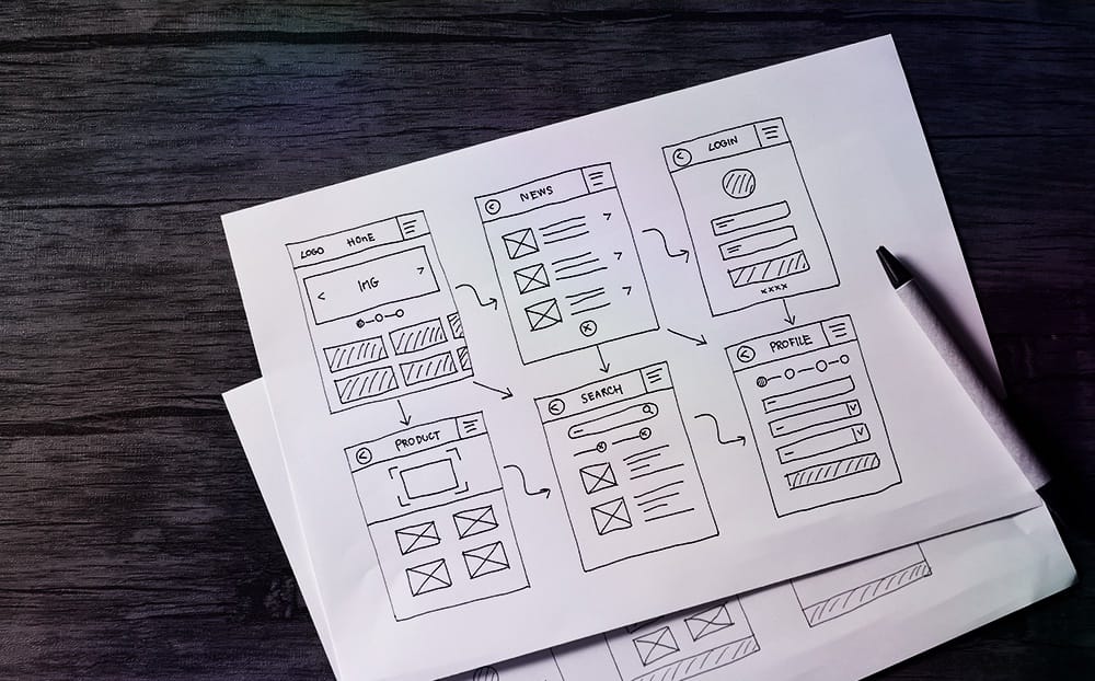
A lot of web design starts in the wrong place: picking colors, choosing fonts, testing animations. Without a structure underneath it, an intentional wireframe that decides where attention goes, none of that holds up.
We start every build with layout. What happens first, what gets clicked, where the eye goes next, what supports the action. Get the foundation right and styling becomes polish instead of a patch over a bad plan.
That is the practical gap between a templated site and one that converts. One reads like a brochure. The other moves people through a path.
“A layout that works is worth more than a layout that only impresses.”
Hierarchy Drives Behavior
Your site should guide rather than guess. Heading levels, callouts, and spacing control the flow. A headline introduces an idea, a subhead keeps momentum, and each block answers a question the visitor already has.
Skip that and people feel overwhelmed, or worse, confused. We simplify the path, cut the number of competing choices, and remove whatever sits between first glance and final click.
Style Goes On Last
Once the layout holds up, we layer in color, type, and imagery to sharpen the experience. Nothing flashy makes up for poor UX. Style is the last decision on the list, on purpose.
Design is how the thing works, and the working parts get laid down first. We carry that through every section, from the hero to the footer.
No Comments